Bright Lights, Sticky Fingers: How Casino Design Is Engineered to Keep You at the Candy Counter
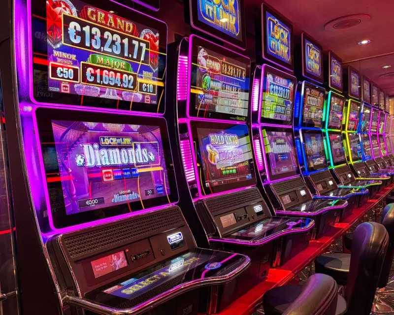
Picture yourself walking into a massive lolly shop. Every shelf is lit up in warm, inviting light. The layout means you have to wander past three rows of tempting treats just to find the exit. The music is cheerful and just fast enough to keep you moving. Nothing in that shop happened by accident — and neither does a single pixel in your favourite Australian online casino.
Design is the silent dealer at every virtual table. It nudges your mood, shortens your sense of time, and quietly encourages you to keep playing when your sensible brain was already halfway out the door. Let's unwrap exactly how it works.
Red, Gold, and the Colour of 'One More Spin'
Colour is the first weapon in the casino designer's toolkit, and it's wielded with remarkable precision.
Red is everywhere in online gambling interfaces — buttons, banners, countdown timers, bonus alerts. That's not a coincidence. Red is physiologically stimulating. It raises your heart rate slightly, triggers urgency, and nudges you toward action. When a 'Claim Bonus' button is red, you're more likely to click it faster and with less deliberation than if it were, say, a calming sage green.
Gold and yellow are the other dominant shades in most AU casino colour palettes. These tones signal reward, wealth, and — critically — winning. Even when you haven't won anything yet, a gold-drenched interface primes your brain to associate the experience with positive outcomes. It's the visual equivalent of someone whispering 'you're doing great, mate' directly into your subconscious.
Blue and purple often appear in the backgrounds or secondary elements. These cooler colours create a sense of depth and luxury without triggering the same get-up-and-go response as red. They're the velvet curtain behind the candy display — they make everything else pop.
The No-Clock, No-Windows Problem
Brick-and-mortar casinos famously removed clocks and natural light decades ago. The goal was simple: disconnect players from external time cues so they lose track of how long they've been there. Online casinos can't remove your phone's clock, but they've found clever workarounds.
Many casino interfaces are designed to be so visually busy and immersive that your attention stays anchored within the screen. Full-screen game modes, animated backgrounds, and continuous micro-celebrations (more on those shortly) all work to create a self-contained world. When every square centimetre of your screen is occupied by spinning symbols, flashing lights, or a live dealer smiling at you, the outside world genuinely recedes.
Some platforms also use ambient soundscapes — gentle, looping audio that mimics the background hum of a casino floor. This audio environment creates a psychological 'container' that's harder to step out of than silence would be.
Micro-Celebrations and the Near-Miss Machine
Here's one of the cleverest — and most worth knowing about — tricks in the design handbook: the celebration of non-wins.
When a pokie pays out less than your original bet, many games still trigger a mini-celebration. Coins cascade. Lights flash. A cheerful jingle plays. From a pure accounting perspective, you've lost money. But the sensory experience tells your brain you've won something. This is called a 'losses disguised as wins' mechanic, and Australian consumer advocates have flagged it repeatedly as a potentially harmful design pattern.
Similarly, the near-miss — two jackpot symbols landing with the third just above or below the payline — creates a sensation of almost winning that's more motivating to many players than an outright loss. It suggests you're close, that the next spin might be the one. Spoiler: statistically, the next spin has exactly the same odds as the last one. The near-miss is a feeling, not a fact.
Button Placement and the Path of Least Resistance
Good UX design is supposed to make things easier for users. Casino UX design makes continuing to play easier, while making stopping just a little bit harder.
The 'Spin' or 'Deal' button is always front and centre, large, and visually prominent. The 'Cashier' or 'Withdraw' options? Often tucked into a hamburger menu, rendered in smaller text, or placed at the top corner where your eye naturally goes last. The 'Autoplay' feature — which removes the need to even press a button between spins — is frequently highlighted and easy to activate.
Deposit flows are streamlined and fast. Withdrawal flows often involve more steps, verification prompts, and waiting periods. None of this is accidental. Friction is deliberately introduced where the casino wants you to pause, and deliberately removed where it wants you to proceed.
Themed Interfaces: The Candy-Coloured Rabbit Hole
Australian online casinos — and yes, we include ourselves in the broader candy-themed universe here at Big Candy Casino — lean heavily into immersive visual themes. Adventure slots come with jungle soundscapes and treasure map interfaces. Mythology games wrap everything in ancient stone textures and dramatic orchestral swells.
The purpose of this theming goes beyond aesthetics. It creates a narrative context that makes you feel like you're on a journey rather than running a financial transaction. Journeys have momentum. Journeys feel incomplete if you stop halfway. A themed interface subtly reframes 'I'm going to stop playing now' as 'I'm abandoning the quest.'
The more immersive the theme, the more psychologically sticky it tends to be. This is why the most visually elaborate games often have the longest average session times.
Spotting the Tricks Before They Spot You
Knowing how the sausage — or in our case, the lolly — is made doesn't mean you can't enjoy it. But awareness is a genuinely useful tool. Here are some practical ways to stay in control:
Set a physical timer. Your phone's clock app is right there. Set an alarm for your intended session length before you start. When it goes off, the decision to continue is now active and conscious rather than passive drift.
Turn off autoplay. It exists to remove friction from continued play. Removing it yourself reintroduces a natural pause point between spins — a moment where you can actually decide whether you want another one.
Notice the near-miss feeling. When you feel that 'so close!' buzz, remind yourself that it's a designed sensation, not a statistical signal. Your odds haven't changed.
Use the cashier button early. Get familiar with where it lives in the interface before you're deep in a session. Knowing where the exit is means you're less likely to stay lost.
Check your balance in dollars, not credits. Many games convert your money into a large number of credits, which psychologically reduces the sense of real-money value. Always translate back to dollars before deciding to reload.
The Sweet Takeaway
Australian online casinos are beautifully designed products — genuinely impressive feats of visual and psychological engineering. That design exists to create an enjoyable experience, yes, but also to maximise the time and money you spend. Understanding the mechanics behind the candy-coloured curtain doesn't make the games less fun. It just means you're playing on your own terms rather than the house's.
And at Big Candy Casino, we reckon that's the sweetest outcome of all.